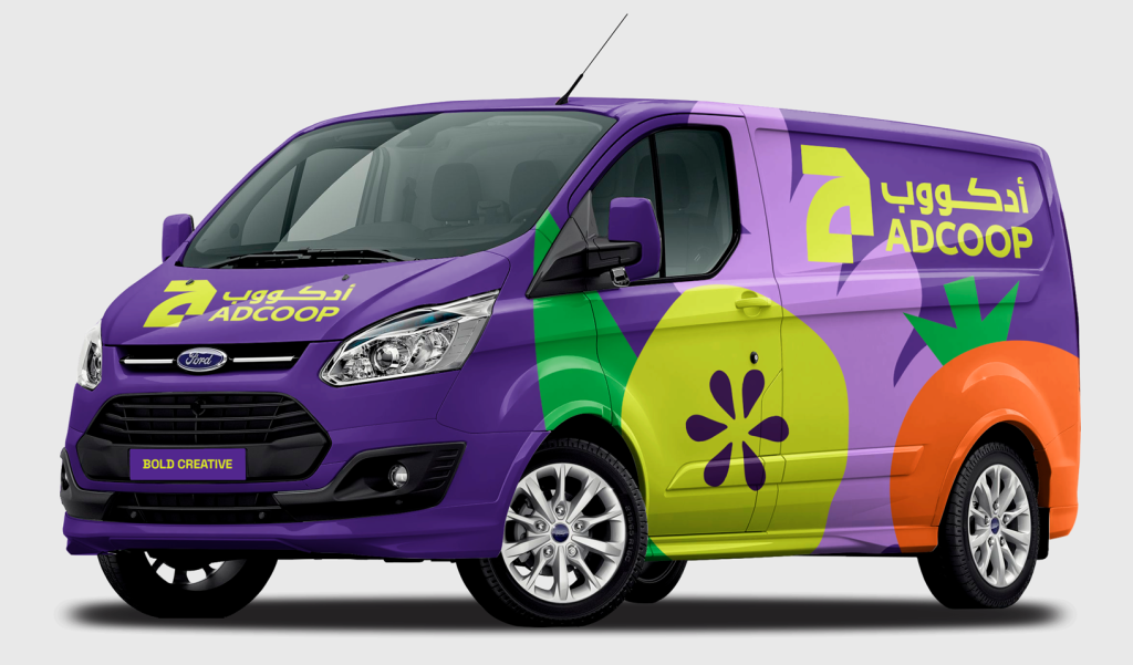
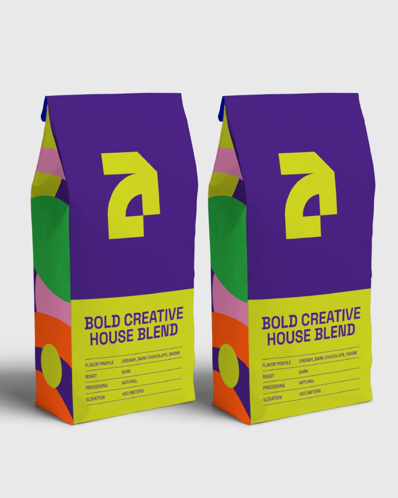
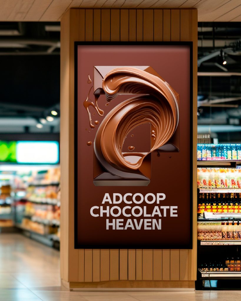
A new bold branding, Logo and Visual identity design and development for ADCOOP, Abu Dhabi Cooperative Society.
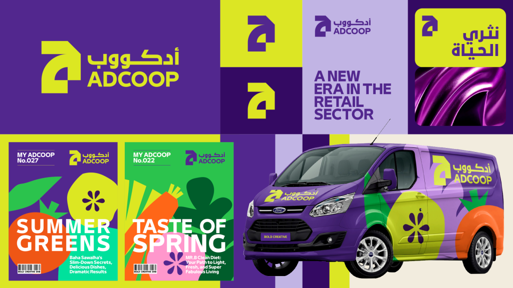
Founded in 1981, the Abu Dhabi Cooperative Society (ADCOOP) is a community-centered retail destination in the UAE, offering exceptional service, unbeatable value, and a shopping experience enriched by Emirati culture and global influences. With a mission to enrich lives and support communities, ADCOOP delivers quality products tailored to the diverse needs of Arab families.
The Beginning
The brand launched in 1981, had its first rebrand in 2013, and now reveals its new identity in 2024. The existing logo, a palm tree with branches representing the seven emirates, holds deep historical significance. The brand colours of green and blue feel outdated and compete in a red ocean landscape.
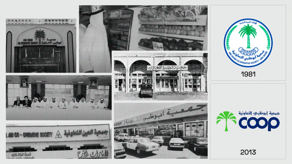
The existing identity struggles with a lack of balance between its English and Arabic components: in English, the branding is simplified to “Coop,” whereas in Arabic, it extends to “Abu Dhabi Cooperative Society,” creating an inconsistency in brand recognition across both languages.
Our mission is to develop a new brand identity system that unites seven leading retail brands under a cohesive identity, that would work seamlessly across all stores and activities to establish ADCOOP as a leading retail cultural brand.
The Creative Process
Through extensive research and collaboration with ADCOOP’s internal team, the creative process begins with a deep exploration of the brand’s origins and the culture from which it emerged. We aim to capture the core essence of the business and develop a bold new personality while maintaining the legacy, setting it apart from the competition.

The Logo: A Modern Evolution of Legacy
At the heart of the brand identity lies the new ADCOOP logo, a simple, bold, and modern symbol, deeply rooted in UAE heritage and designed for a global audience.
The new ADCOOP logo design is inspired by the iconic old Emirati doors and gateways. These are more than just architectural features; they symbolise the gateway to the heart and soul of Emirati and Arab communities.
Representing the entrance to family homes, these doors embody the values of hospitality, family and community that are central to traditional lifestyles. The brand mark was developed based on an abstract form of the Arabic “Hamza” and the letter “a,” creating a logo that bridges the past and the future, the East and West.


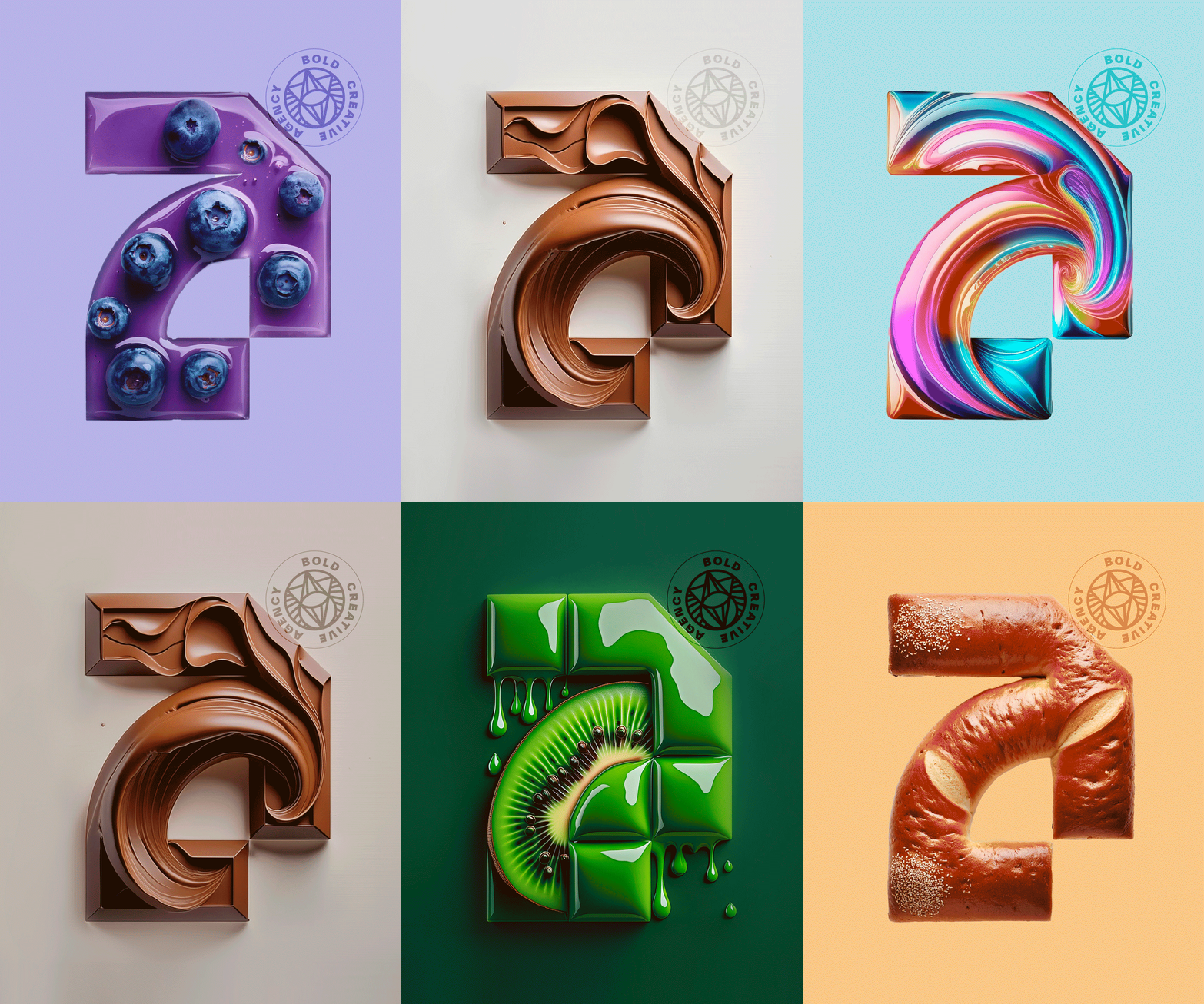
The symbol also features an upward arrow, signifying ADCOOP’s commitment to the future of the local food industry in the UAE. The brand supports a vertically integrated strategy aimed at building food security and driving economic prosperity.
The logo represents more than just food; it is a commitment to delivering quality, safety, and satisfaction while honouring cultural values in a bold and futuristic way.
The overall design reflects ADCOOP’s role as a bridge between modern global food offerings and the traditional lifestyles of its global and local customers. By embracing both heritage and innovation, ADCOOP ensures it enriches lives today and lays the foundation for a prosperous future for generations to come.
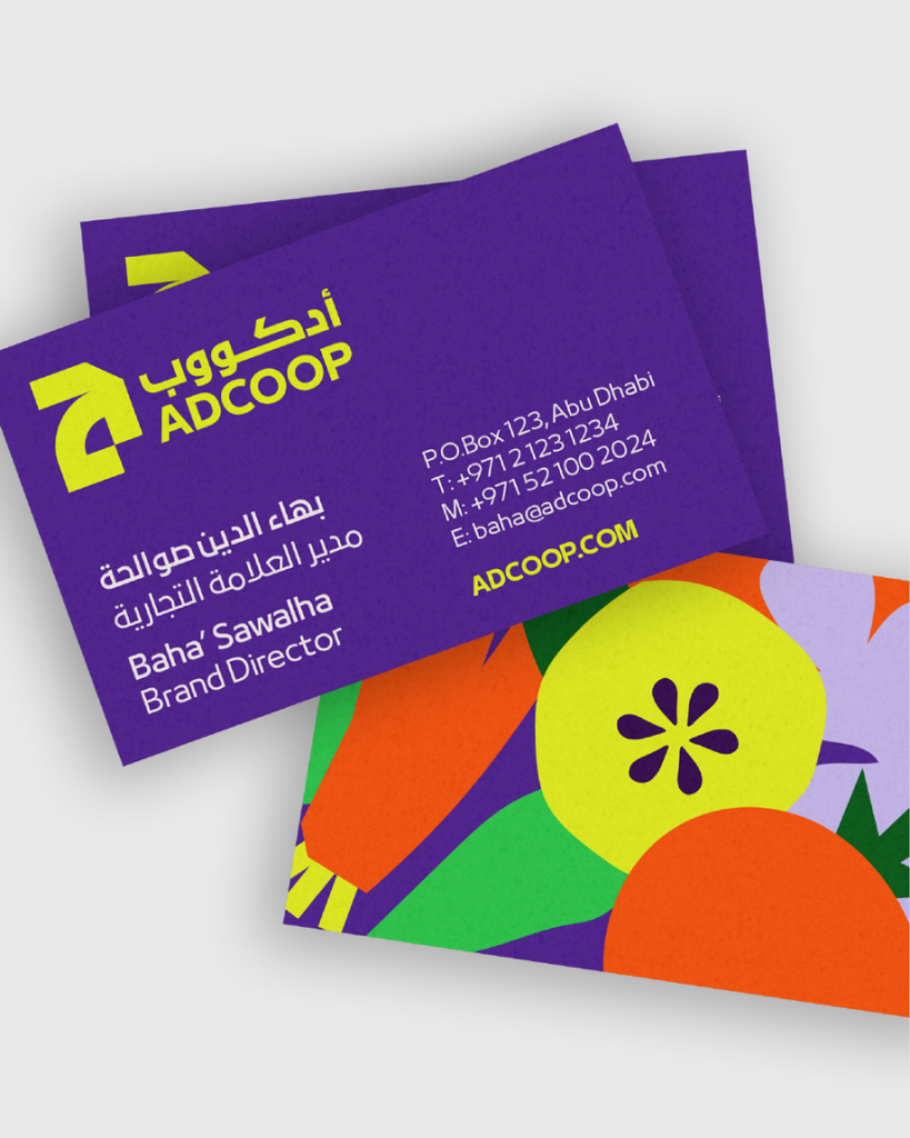
The Brand Look & Feel
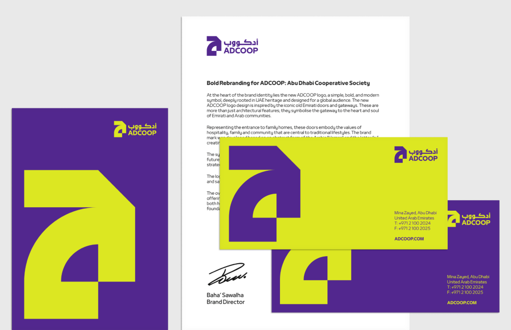
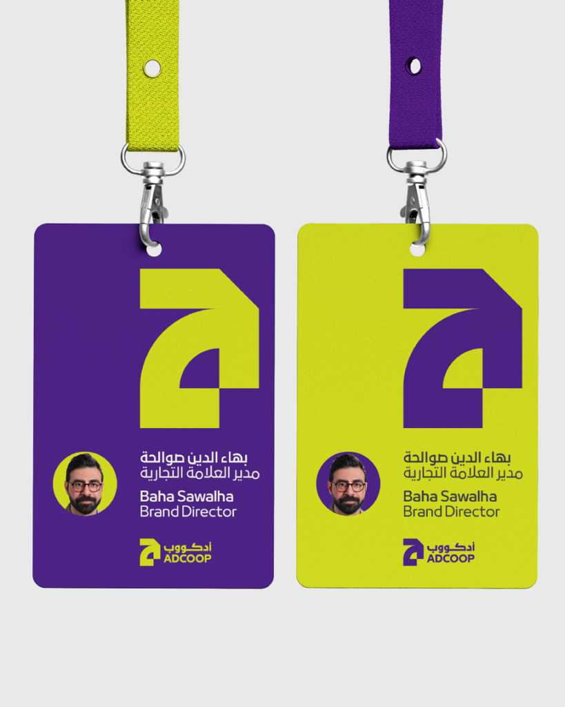
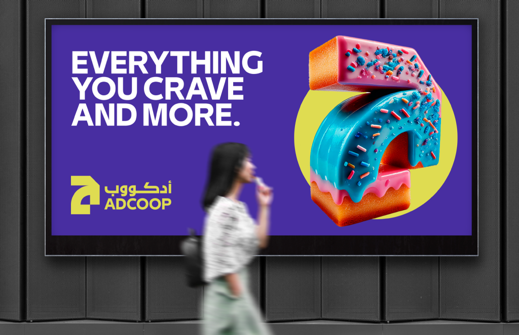
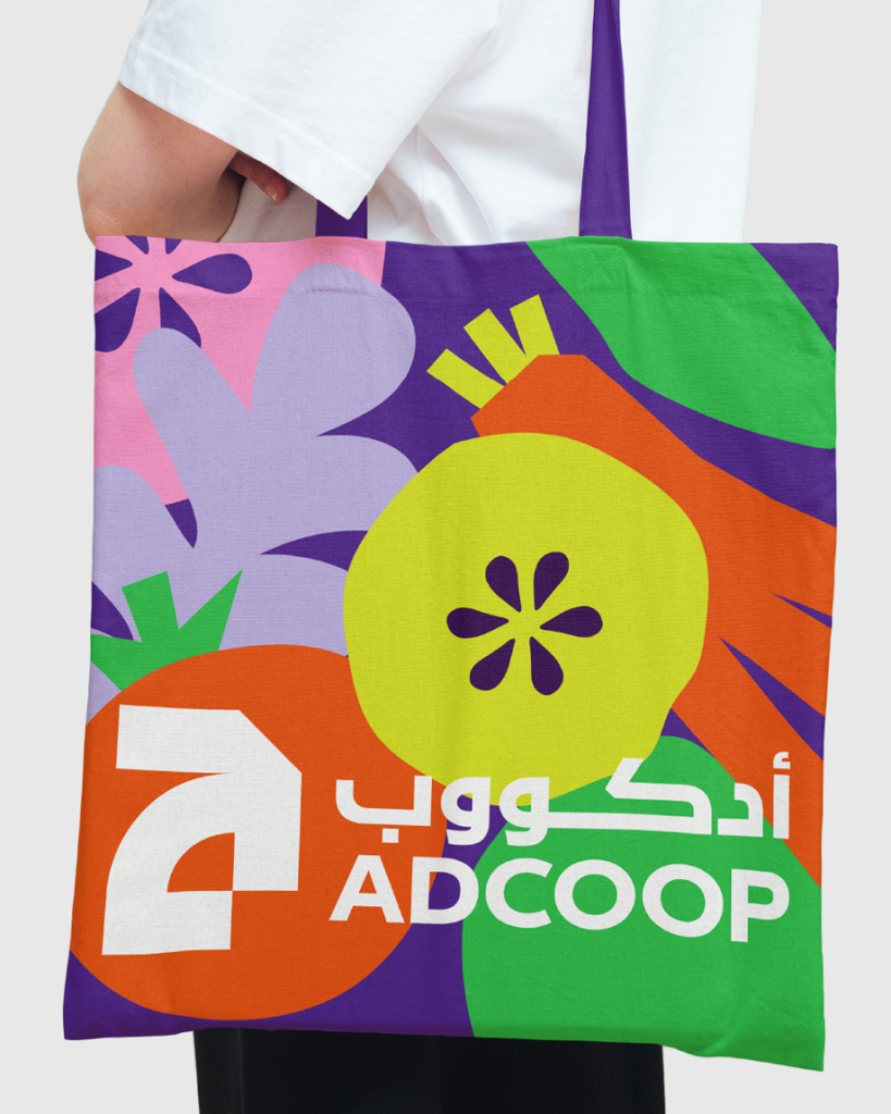
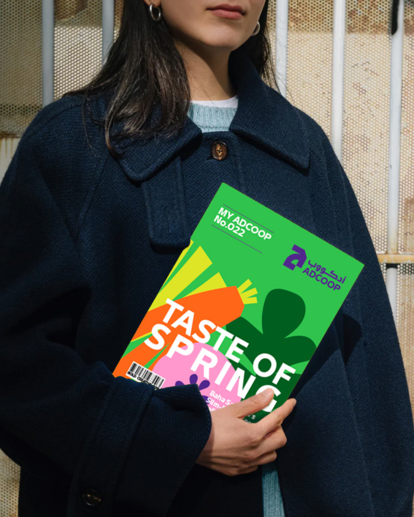
With a clean, modern, bold layout, photography style and a refined colour palette, the ADCOOP brand identity conveys trust, reliability, growth and sustainability. It stands as a bold visual statement, reflecting ADCOOP’s core values of innovation, quality, growth and an enduring commitment to both the community and the environment.
The new ADCOOP brand represents the perfect balance between ADCOOP’s cultural heritage and its forward-looking vision, centred on enriching the lives of its customers and community. Rooted in local tradition yet forward-thinking, ADCOOP serves as a bridge between heritage and innovation, offering a welcoming space for all while delivering quality products, sustainability, and value.
The Brand Guidelines
With a massive brand like ADCOOP, which has many stores of all sizes and works with all kinds of suppliers and third parties, we created detailed, strict brand guidelines to ensure brand consistency and effectively manage and implement the brand across all touchpoints. I look forward to seeing the brand come to life and be executed the way we intended.